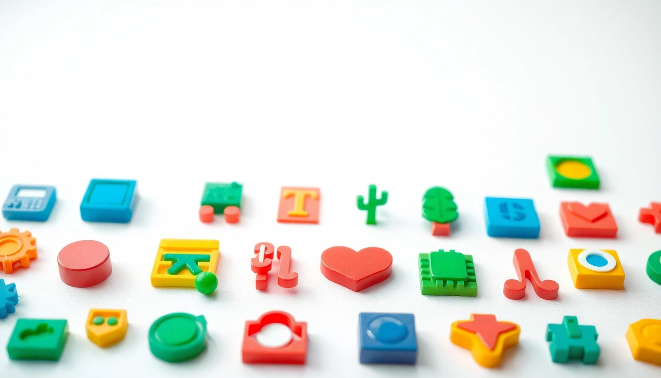
Understanding the Importance of Icons
In an increasingly digital landscape, the use of Icons has transcended mere aesthetic value. Icons serve as essential visual elements that enhance communication, usability, and engagement across various platforms and applications. Their role is not limited to decoration; they are powerful tools that can drastically affect how users interact with content and features. By simplifying information and providing immediate recognition, Icons contribute to a more intuitive user experience.
Defining Icons and Their Purpose
Icons are graphical representations designed to communicate specific meanings or functionalities. Their primary purpose is to convey information quickly and efficiently. During the design process, careful thought must be given to the Symbolism, simplicity, and relevance of Icons. For instance, a trash can Icon universally represents the function of deletion, allowing users to identify its purpose at a glance. Additionally, Icons can transcend language barriers, making them particularly valuable in globalized digital environments.
Key Characteristics of Effective Icons
Not all Icons are created equal; effective Icons share certain key characteristics:
- Simplicity: Effective Icons are easy to recognize and understand. They should eliminate unnecessary details while retaining recognizable features.
- Scalability: Icons must remain clear and identifiable at various sizes. An ideal Icon is equally efficient on a mobile screen as it is in a detailed desktop interface.
- Consistency: Using a uniform style enhances the visual coherence of a design. Consistency in color, shape, and size aids users in navigating interfaces more smoothly.
- Relevance: Icons should correlate directly with the action they represent. Misleading Icons create confusion and can lead to frustration.
How Icons Influence User Interaction
Icons act as navigational aids, helping users understand the layout of applications and websites. They reduce cognitive load, allowing users to grasp functionalities without sifting through text. Research has shown that users can process visual information faster than text, making Icons a preferred choice for enhancing engagement. Whether it’s a thumbs-up Icon for liking a post or a cart Icon for shopping, these graphics can convey complex actions in a glance, fostering seamless interaction.
Types of Icons and Their Applications
Navigation Icons for Enhanced Usability
Navigation Icons are essential in guiding users through digital spaces. These Icons include home, back, next, and menu Icons, which are pivotal in ensuring that users can move through a site or application intuitively. Well-designed navigation Icons offer visual cues that reduce the need for text. For example, a home Icon typically signifies returning to the homepage, making it easy for users to find their way back without confusion.
Functional Icons That Improve Clarity
Functional Icons serve a specific purpose and enhance clarity by providing instant recognition of actions. For instance, a magnifying glass Icon is widely understood as a symbol for search. Similarly, envelope Icons are instantly associated with email functionality. These Icons improve the user’s experience by minimizing misunderstandings about what each button or action entails.
Decorative Icons in Modern Design
While primarily functional, Icons can also serve decorative roles in modern design. These Icons enrich digital aesthetics and can highlight brand identity. For instance, a beautifully crafted Icon set can elevate a brand’s image and lend a cohesive look to an interface. When utilized creatively, decorative Icons can transform standard layouts into engaging, vibrant experiences that create a connection with the user.
Best Practices for Designing Icons
Choosing Color Schemes and Styles
The choice of colors and styles plays a significant role in the effectiveness of Icons. A well-considered color palette can greatly enhance visibility and convey intended emotions. For instance, brighter colors may evoke excitement, while softer hues can create a calming effect. It’s vital to ensure that the chosen colors align with the overall branding and message of the application or website.
Additionally, the style of Icons—whether flat, outlined, or three-dimensional—should be consistent throughout the design to maintain the interface’s harmony. As a rule of thumb, the Icon style should complement the purpose of the application. For example, a minimalistic design works better for a modern app focused on functionality.
Ensuring Scalability and Clarity
Clarity is paramount in Icon design. Icons must be distinguishable at various sizes and resolutions, especially given the wide range of devices used today. Implementing vector graphics can ensure that scaling does not compromise clarity. It is advisable to test Icons at multiple sizes and on different backgrounds to ascertain visual effectiveness.
Implementing Icons in User Interfaces
Effective implementation of Icons in user interfaces requires strategic placement and usage. Icons should be paired with text labels to enhance understanding, particularly in areas where users may be unfamiliar with the functionality. Moreover, proper spacing between Icons is crucial to prevent a cluttered appearance, leading to better usability and more engaging interactions.
Tools and Resources for Icon Creation
Popular Design Software for Icons
Creating Icons requires the right tools. Popular design software such as Adobe Illustrator, Sketch, and Figma provides robust features for crafting custom Icons. These platforms offer versatility and a range of tools that streamline the creation process, allowing designers to focus on the artistic aspect while ensuring scalability and clarity are maintained.
Online Resources for Icon Inspiration
Finding inspiration is vital for any design project. Platforms like Behance and Dribbble showcase innovative Icon designs and offer a glimpse into current trends and creative ideas. Browsing these sites can fuel creativity and lead to unique approaches to Icon design. Additionally, many websites host collections of free and premium Icon sets, which can serve as starting points or references during the design process.
Community Platforms for Feedback
Feedback is an essential component of the design process. Community platforms such as Reddit, design forums, and social media can be excellent venues for gathering opinions on Icon designs. Engaging with fellow designers and potential users can provide valuable insights that help refine and improve Icons before final implementation.
Measuring the Impact of Icons on Usability
Assessing User Engagement and Satisfaction
Evaluating the effectiveness of Icons is critical for continuous improvement. Conducting user surveys and gathering feedback on Icon usability can identify potential areas for enhancement. By asking targeted questions about recognition and ease of use, designers can make informed adjustments.
Additionally, analyzing user engagement metrics—such as click-through rates on Icon interactions—can illustrate how well Icons serve their intended purpose. Icons that lead to higher engagement typically indicate successful recognition and functionality.
Tools for Analyzing Icon Performance
There are numerous analytical tools available to assess Icon performance effectively. User testing platforms allow for observational studies, gathering real-time data on how users interact with Icons. Heatmaps can visually display where users are clicking the most, providing insight into effective versus ineffective design elements.
Iterating Icons Based on User Feedback
Icon design is an iterative process. Utilizing feedback and performance data, designers can make targeted adjustments to enhance usability continually. A/B testing can be particularly effective—by presenting users with different Icon designs and measuring their preferences, designers can identify which elements work best in engagement and clarity.